Thursday 30 January 2014

Q6 Continued

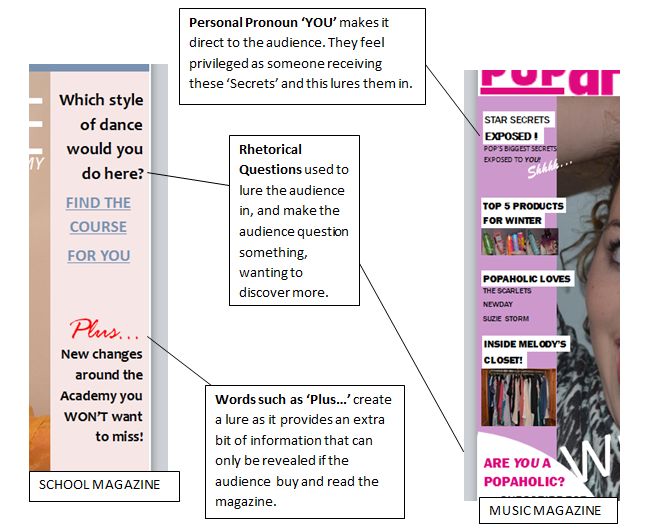
I also used my iPhone, to take some practice photographs. I did this in school, against a white background so that I could get an idea of the types of poses and shots I wanted my model to do, for the main image on my cover. For example I tried out some high angle shots, as well as an eye level shot which I think worked really well as it would mean the direct address towards the audience would come across, and the message of my pop magazine would be clear to the target audience.
This meant that the mise-en-scene of the photographs were quite bare, however in my real photos the setting would be improved, by using a clear white background.

This is something I did for my final product that I had not done for my preliminary task. I think by taking some practice photographs helped me a lot to plan my shots more, therefore I feel this helped me develop further in my photography.


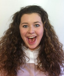
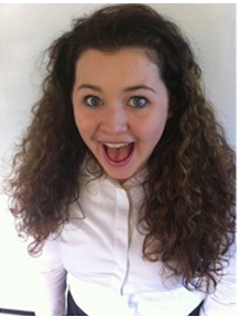
The photos above were taken on my iPhone, as practice photography.
By trying different angles such as a high-angle shot, and an eye-level shot, it helped me decide which I prefer for my magazine.
I ended up using the same pose that is used on the top photo, because I thought it was appropriate for my main story and my genre of 'pop', as it is a common theme for pop magazines to use a 'posed' shot on their front cover, to attract the audience's attention, as well as using a fun and exciting pose like the one I have chosen, to suit the style that interests the young, fresh, teenage audience of pop.


When I began taking my final photographs, I used my Nikon camera, which was great as it creates a clear, sharp, colourful image without blurring or red-eye. It also made my photographs look much more professional than my practice photos that I took on my phone.

Q6 Continued- [Photoshop]

Another technology i learnt to use for the benefit of my product was Photoshop Editing. This was something completely new to me, as I had never used it before.

I found Photoshop really useful, and very beneficial for my photographs, especially for my preliminary task, as the photos didn't come out as good as I had hoped. They were slightly blurred and dark, therefore I used Photoshop to edit the quality of the photos.


You can clearly see the difference in brightness, sharpness and overall quality of the photos. This made my photographs look much more professional and suitable to be placed on the cover of my magazine.


Tuesday 28 January 2014

Evaluation Q7- Looking back at your Preliminary Task, what do you feel you have learnt in the progression from it to the full product?

Looking back at your Preliminary Task, what do you feel you have learnt in the progression from it to the full product?


The first thing I will look at is how I have progressed in my Photography skills through creating my school magazine to my music magazine.


Learning Photography Skills:
The very first thing I learnt about photography, which helped me develop later in my magazine production, was the Camera Angles, Shots, Sizes and Positioning. These aspects of photography all have influences on the target audience, and all have a purpose.

For example, we first looked at the Close-Up shot. This gives the audience a closer view, and a real insight on the objects facial expressions and emotion. Another thing we looked at was the Eye Level Shot, which I have used in my final product, as it was conventional for the genre I have chosen.


The grids above show the different shot sizes, and angles. These are the guides we used as a class when experimenting with photography ourselves. We used the iPad's to do this, and I learnt a lot, from how to frame the object I want, to how to angle the camera to create the different types of shots.
I found this really helped me develop my photography skills, and prepared me for the creation of my final product.
I can notice a development in my photography, from my school magazine creation, to the final product of my music magazine.

Q7 Continued- [Photography]

SCHOOL MAGAZINE PHOTOGRAPHY
MUSIC MAGAZINE PHOTOGRAPHY
Comparing these two photographs, you can see a difference in colour, brightness and overall quality.
These are a few of the things that I think affected my photography during the making of my school magazine:
  1. Lighting - As I chose to take my photos during the late afternoon, and indoors, there was very little daylight so I did needed to use the flash. When I realized the flash was creating shadows I resorted back to   no-flash, which made my photos darker, and the colour was not as clear as I'd had hoped. 
  2. Background - Firstly, I did not know which background would be the best for my photographs, therefore was not prepared for my photography session. I ended up using a white blind against a window. This was okay, but as I could not use flash, the photos came out darker than expected and because of this, the white background looks grey on the photos. 
  3. Time of Day- As I mentioned, because my photos were taken in the late afternoon, there was little daylight. This affected my photos and is something I had to change when producing my end product

Looking at the things that affected my photography, I made sure I improved on these aspects, and ensured I was more prepared for the photography of my end product.
Firstly, I improved the lighting by using flash and reducing the amount of shadows using a mirror to reflect the light. I did keep the background the same, as it was a good colour for my photographs, however the time of day changed and I took my photographs around midday, to ensure there was more daylight.


Camera Shots:

For my school magazine, I had to use a Medium Close-Up, and in this shot, the model is not looking at the camera, but it was still a 'posed' shot, as the model is doing a typical ballerina pose. This is something I thought didn't need direct eye contact with the audience, as it was not fitting for the theme of the magazine, but also because the photo spoke for itself and captured the audience's attention without eye contact.

However, with my end product of my music magazine, I thought differently. As I chose the genre of 'pop', I had noticed after doing a lot of research that it was very conventional for the model on the cover to have direct eye contact with the audience, by looking at the camera.
I like the way my main image turned out, and I think with the facial expression and the 'posed' shot, the image fits the genre as well as attracting the target audience.


Q7 Continued- [Layout]


One final thing that I think I have improved on from creating my preliminary task to my full product is the Layout. I think I have learnt how a magazine conventionally lays all their features out on the cover, the inside pages and the contents page too. This has helped me in making my final product.


Comparing my School Magazine to my Music Magazine:
  • I did not include many features to the cover, therefore it looked bare and slightly boring, in comparison to my music magazine, which has a variety of colour, fun features and many more diverse and original aspects that would grab the audience's attention (conventional of a pop magazine).
  • Better use of conventions in the final product, for example using a Byline- typical of a pop magazine, with all the different features written along the bottom of the cover.
  • Text and font to suit the audience and genre (Pop- fun, girly, 'typical pop' text). However I was unaware of how to approach my school magazine as the genre wasn't as clear and simple.
  • Colour palette is much more vibrant and attractive on my pop magazine, contrasting to the dull, less attractive colours on my school magazine. (The difference was that my school magazine was aimed at both genders so was more difficult to produce conventionally yet attractively).

Saturday 25 January 2014

Q7 Continued- [Conventions]


Another thing I have developed on over this period of time is my knowledge of Conventions, and features of a magazine.


When I began planning my preliminary task of my school magazine, I knew very little about conventions and how they should be properly used to attract the target audience. However, through research and analysis of different magazines, I learnt more about how magazines use conventions to lure their audience in, in certain ways I didn't know about originally.

I developed through research, and began my music magazine, applying the conventions I had learnt, and I think I had better approach on conventions than I did on my preliminary task.
For my music magazine, I chose the genre of 'pop' music, which suited me as I know quite a bit about this genre, favouring it as my own personal choice of music to listen to.

Therefore, I knew what sorts of things would attract the audience, which is a big part of the magazine's aim. As well as my own knowledge, I did some research to gain further knowledge on these conventional features of a pop magazine.

These are a few of the Conventions I used throughout the development to my full product:

LURES


ANCHORAGE TEXT


COLOUR PALETTE

From my school magazine to my music magazine, I have created a more developed knowledge on conventional themes, such as colour scheme, and I have used the colour scheme in my final product to my advantage, as it clearly represents the target audience- teenage girls.
This is something I was not as aware of when creating my preliminary task, therefore the colour scheme is less attractive to it's target audience, although it does follow the colour scheme throughout.


Q7 Continued- [Editing]

Linking to the development of my Photography, I think one of the main things that helped me develop my photography within both products was Photoshop and Editing.
This concept helped me to give my photos a more professional look, and adjust things such as brightness, sharpness and overall quality of the photos.


BEFORE

AFTER


This is a comparison of one of my photos, from my school magazine. It shows the photo before and after Photoshop editing. You can see the clear difference in brightness, as I noticed the photo was rather dark and felt it needed brightening through Photoshop.

In the first image you can see a slight shadow on the wall behind, which has been faded with the help of Photoshop.
Also, the photo looks much sharper. This makes it much more professional and suitable for a magazine front cover.


I think the use of Editing helped my skills develop along with my photography, as it let me understand this side of my creation, and I learnt how important it is for a photo to be just right, as it can be so powerful as the focal point of a magazine front cover, in my case.
I used what I learnt here to develop my photography in my final product. For this final product, I feel I did improve in my photography, and the photos came out looking much clearer and sharper.


This is an example of one of the photographs taken for my music magazine, the final product. It is clearly a much more professional photo than those of my school magazine, as I have developed my photography and editing skills over that duration of time.