Thursday 28 November 2013

Magazine Interviews

As my double page spread is going to be an exclusive interview with a pop star I have created, I wanted to make sure I had some research to help me decide on the layout, style and features to include in this interview page.

This is an interview from the magazine 'We Love Pop'. Most commonly, the interviews are used within the double page spreads, and feature the star that was shown on the front cover. This is exactly what I have chosen to do with my magazine.

This is a similar story to my magazine's too, as it is about 'Cher Lloyd' being a bad influence of children. My story is about a pop star being a 'Wild Child' based on the anchorage text on the front cover.


This magazine interview, with Justin Bieber is one about bullying, which is an issue that some school children can relate to. The 'Help and Advice' text box could therefore be helpful  for some readers.

My magazine is also aimed at a young audience therefore I will make sure my story is suitable for that age range, and use words and phrases they can easily understand and relate to in some way.


Saturday 23 November 2013

Contents Page Research

I have started doing some research on contents pages of other pop magazines, now that I have mostly finished my front cover.

I looked at 'Top of the Pops' and 'We Love Pop'.
They both had completely different page designs, conventions and colour palettes.


TOP OF THE POPS


WE LOVE POP


Judging by this research, I would say the magazine contents page that looks most like mine would be 'Top of the Pops' as the colour palette of this particular issue is more girly, with pink and yellow. Also, on the 'We Love Pop' contents page, there are much more male colours such as green and blue used. 


I think my research and analysis will definitely help me create a suitable style for my magazine, that not only matches my front cover but fits the genre, and most of all fits the audience profile.


Photography on the Front Cover

This is my front cover as it stand now. I may have a few changes to make, but it is mostly finished.

I really like how it has turned out, as I have managed to carry out all the ideas I had from the start, and used them effectively to create the conventions of this magazine.


Music Mag Photography

These are the photographs I took, before making the final decision on which ones I would use in my magazine.
When taking the photo's I tried to create a picture in my mind of what they would look like on the page, aswell as how they would come across to my audience.

I wanted to have a varied collection of photo's so that when I came to decide which one fits best with my page design, I would have more than one option.

The model I used, my friend Ellie, has long curly hair, which I thought really fitted the theme of my lead cover story- 'Wild Child'
The choice of clothing was very fitting too, as Ellie wore a grey and white animal print dress on most of the photo's.


This final photo is the one I am considering on using for the double page spread, as it contrasts with the other photo's, as Ellie is wearing a different outfit, and her expression is much more serious and relaxed.

Friday 22 November 2013

Practice Photography

To get an idea on the kind of photos I want to use on my magazine cover, I took some on my phone during school. I used a simple white background from the projector whiteboard. This worked well and created minimal shadows.This brought me to the conclusion that I definitely want to use a white background when I come to take my real photographs.

This is some of the practice photography I have taken for my magazine:

1


2                                                     3


I tried to use a variety of camera angles and shots to give me a set of photos that I could consider.
The photograph I think works best with my cover story is number 1, because the pose would look on the cover, or inside the double page spread.
However, I would adjust the pose slightly, and maybe make it more dramatic and fitting with the story.
Also, the lighting and placement of the background need to be changed, because as the image shows, the shadow is visible below the chest, as well as the black line from the board I used.


Front Cover

Over the last few weeks I have been developing my front cover to make it look conventional, to make the target audience clear, and to make sure it appeals to my audience.

Here are some pictures to show the development, without any photography at this stage:

Before

After

Now

After experimenting with colours, fonts and the overall layout, I have produced a magazine front cover that looks quite conventional. I still have a lot to do to finish this cover but so far I am happy with the way it is coming along.
The photography, when added to the page, may change certain aspects of the colour palette or layout, but those are things I can adjust easily.


Background Colour

Before I took my photographs, and applied them to the magazine cover, I wanted to make sure that I had an idea on the background colour I wanted to use. 


I had a look on Google at some of the magazine covers around nowadays, and look at how their colour plays a big part in how the magazine's genre as well as audience comes across. Also, when using a certain colour/or colours, the model on the main image sometimes matches that colour scheme.


For example, here the model on the main image of the cover stands out as she is the centre focus point, however you can see clearly that she matches the colour scheme of the entire cover including the background colour, white.                   This makes the masthead stand out more than the actual image in certain ways, as the masthead is the only splash colour, blue.

However it does work in some ways, for example the pose. The model is posing with a dominating attitude which makes the reader think the magazine is important to read too.


This magazine cover on the other hand works really well as the choice of clothing worn by the model contrasts with the background, also white. The clothing is bright coloured and fun, which completely contrasts with the dull background.       

Also, the text colour, pink, contributes to the main image, bringing out the bright colours of her outfit.            
I like this magazine cover and I am thinking of incorporating this concept of background colour into my work, now that I have done some research.                                                                                 


Thursday 21 November 2013

Audience Profile

My music magazine is aimed at teenage girls, which means I have a specific audience to impress.

I used a few publisher's websites to research on their magazines, and how they achieve their audience profiles.


http://magazines.bauermediaadvertising.com/audience-finder


I used the 'audience finder' on Bauer's website, to discover what audience profiles look like.
I chose the male/female option, to look at the percentage of male and female readers.

'Kerrang' magazine's audience profile, showed above is quite equal between male and female readers.
However, 'Q' Magazine's audience has a majority of male readers.

For my magazine, (a pop music magazine) the percentage would be very high for female readers, and very low for male readers, perhaps none at all.


Wednesday 20 November 2013

Publishers

When thinking about my audience profile, and how I am going to make this clear throughout my magazine, I did some research to find some of the big publishers in the magazine industry and discover how they create their audience profiles.

A few of the major publishing company's are:

  • BAUER
  • IPC MEDIA
  • EMAP
  • NATIONAL MAGAZINE COMPANY

An audience profile is normally made clear with certain aspects to a magazine such as a niche audience or a target mainstream.

Tuesday 19 November 2013

Lead Cover Story Plans

To come up with some ideas on what to create as my cover story, I asked a few friends on what they would choose to read if they were the target audience.

I came up with some initial ideas, all related to a celebrity based story on a 'pop music' theme.

A few of my ideas are:


Photography Plans

I have been thinking about my magazine front cover, and have come up with a few ideas on my photography for my lead cover story.

I want something that suits the genre of the magazine as well as targeting my audience of teenage girls.

As I want the cover story to be the stand-out piece of the magazine, I will ensure my photography makes this obvious. By using a close-up shot, I can give the story a sense of importance to the magazine.

This is an example of a close-up shot used on an issue of a pop magazine.


  • In this image, although it is not a close-up shot, I like the idea of the hairstyle and the clothing/costume making the image appeal to the audience. 
  • With the model making eye-contact with the audience, it gives the reader a sense of involvement in the story, almost like the model is talking directly to them.
  • The bold colours on the dress of the model, as well as the necklace she is wearing, completely match the colour palette. This is another trick the magazine uses to lure the reader in.


How Magazines Profile their Target Audience

When researching magazines, I notice how they each have a specific look, and an identifiable target audience. The use of conventions, colours and themes throughout the magazine helps them target their audience.

Examples:


NME

'NME' Magazine is a rock-influenced magazine.

'NME' profiles their audience by using artists on the cover that appeal to the audience. for example, the artist on this cover is Billie Joe from Green Day. This band is well known and represents the genre of this magazine.

This makes the magazine stand out to people not only who like rock music, but who like the band Green Day too.

http://www.nme.com/


SEVENTEEN

'Seventeen' is an American magazine aimed at 12–19 year-old females.

The target audience of 'Young girls' is obvious to me, as the colours are stereo typically 'girly' with pink, yellow and orange used.

'Seventeen' profiles their audience with the use of the artist on the cover. 

As Beyonce is a very famous singer, this issue would gain a lot of attention from her fans. 

http://www.seventeen.com/


VIBE

'Vibe' is a Hip- Hop magazine, and this is obvious to me through the use of colours and fonts, aswell as artists on the cover.

Chris Brown is used to represent the genre, as he is a well known        hip-hop artist.

The magazine profiles their audience by using make colours, to suggest that the magazine is aimed mainly at males. These colours also connotate the hip-hop genre.

http://www.vibe.com/


BILLBOARD

'Billboard' is a magazine that involves all music genres. This makes the target audience more varied, and much less specific to a certain group.
This means the magazine can apply to simply anyone.

On the cover, the use of a multi-coloured masthead represents the variety of music the magazine provides to their audience, as the colours do not represent a certain gender or group of people.

The background colour, grey, is dull and makes the masthead stand out.

http://www.billboard.com/

Monday 11 November 2013

Starting my Music Mag

This is the development of my music magazine front cover so far. I still need to decide on a masthead that i will get feedback on.


Sunday 10 November 2013

Editing My Masthead

After making the decision on which masthead design I would use for my magazine, I started editing it to make it bolder and clearer.

To do this, I used 'Paint' to adjust the outline of the letters to make them appear clearer and to get rid of any blurred lines.

Using the rubber on paint, I managed to remove the blurred lines and now the masthead looks much more effective as it stands out clearer with sharper outlines to each letter.


BEFORE


AFTER


As you can see in these images, the lines are much smoother and much less blurred. This is just a small thing I have done to improve the quality of my magazine.

Choosing a Masthead

I created a masthead on http://www.dafont.com/ before editing it to give myself a few options.

I narrowed my decision down to these two masthead designs, and made notes on my thoughts of them:


For me, the best masthead for the magazine I am producing is this one below:

My Chosen Masthead


Colour Palette

The genre and main theme of my music magazine is 'Pop', therefore I need to ensure my colour palette fits this theme.

As my target audience is teenage girls, my colour palette will include pink and purple, with a splash colour of something more vibrant, like yellow or orange.

This shows the colours I am considering for my colour palette. I still need to chose one or two main colours, as well as a different colour as my splash colour.


In most of the Pop magazines I have looked at, the main colours are pink and purple:
This magazine uses pink as its main colour and yellow as a splash colour.

However, this issue, of the same magazine swaps the colours by using yellow as the main colour and pink as the splash. I think this works really well to make every issue of the magazine different.


Masthead


I have been playing around with a few different magazine names, making the masthead look as professional and conventional as possible, ensuring that the masthead also fits in with the genre of music.

These are a few examples of the names I may use for my magazine, along with the feedback I received during peer assessment:


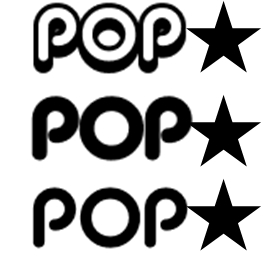
Here, I experimented with the font style and the star logo, to see which fitted the best together.

Peer Assessment Feedback: People said that this particular font style is "Too similar to the 'Top of the Pops'"
                                            However, "the genre and target audience is made clear through the word 'Pop'"


I also experimented with the name, keeping the genre 'Pop' in the name, but making it abit more creative.
I like that 'Popaholic' is very original in that no other magazine is named anything like this.

Peer Assessment Feedback: People said this was the best masthead as "it is original and a creative name"
                                            However, "consider changing the colour to fit the target audience- girls"


I played around with colour on this masthead. I used different shades of pink and purple, because these colours will fit my genre, as well as my target audience.

Peer Assessment Feedback: People said "the colours make the target audience very obvious"


I then moved the lettering around abit, by adding an underline to the 'Pop' to emphasise the genre further, and make the word 'Pop' stand out to the target audience.


Tuesday 5 November 2013

House Style

Magazines are all very unique in their appearance, their house style, their branding and their use of images, fonts and colours. Everything within a magazine shapes the target audience, and makes it obvious to the person viewing it who it is supposed to be aimed at.

TOP OF THE POPS-

This magazine has undergone a lot of changes over the years, as sales have gradually decreased.
However, they have tried to keep certain things the same:


     This is the 'TOTP' Magazine as it is today, 2013.


The changes:
  • The Masthead has been changed around quite a lot over the years, however brand recognition stayed as the masthead stayed in the same place.
  • The layout has become more structured, however there is much more on the cover than before.
House Style:
  •     The thing that seems to have stayed the same throughout the years is the colour pallet. With pinks and purples as the main two colours, it is obvious that the target audience has stayed the same too, aiming mainly at girls, aged between 11 and 15.


Music Magazine Plan

Genre- Pop Music


Target Audience- Teenage Girls (Aged 12-16)


Masthead- 'Love Pop'


Colour Pallet- Pink/Purple, Black and White
Splash- Orange or Yellow


Main Image- Female artist or Girl band (?)