These are a few examples of the names I may use for my magazine, along with the feedback I received during peer assessment:
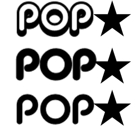

Peer Assessment Feedback: People said that this particular font style is "Too similar to the 'Top of the Pops'"
However, "the genre and target audience is made clear through the word 'Pop'"


I also experimented with the name, keeping the genre 'Pop' in the name, but making it abit more creative.
I like that 'Popaholic' is very original in that no other magazine is named anything like this.
Peer Assessment Feedback: People said this was the best masthead as "it is original and a creative name"
However, "consider changing the colour to fit the target audience- girls"

I played around with colour on this masthead. I used different shades of pink and purple, because these colours will fit my genre, as well as my target audience.
Peer Assessment Feedback: People said "the colours make the target audience very obvious"

I then moved the lettering around abit, by adding an underline to the 'Pop' to emphasise the genre further, and make the word 'Pop' stand out to the target audience.
No comments:
Post a Comment